
Risk Manager with AI-Powered Document
Enhancement.
Creating Risk and Configuring Risk Ranking factors in Life Sciences can be complex, requiring a user-friendly approach for defining values like severity, likelihood, and detectability. We have addressed 3 major problem statements in this case study.
First is how we have re-designed the Risk creation from a simple form to a canvas approach. Second is how we have solved the Interaction issue having multiple hirarchies of information where a user can configure mutliple values for each factor. To enhance usability, we designed an intuitive configuration interface with Simplified factor input using popup over, input fields, and guided recommendations.
Third is, to improve clarity in risk-related documentation, we introduced an AI-powered document image upscaling feature that:
🔹 Enhances scanned or low-quality images for better readability.
🔹 Applies intelligent sharpening and noise reduction to maintain accuracy.This approach ensures seamless risk ranking customization and high-quality documentation, improving compliance and decision-making.
About the Project
Risk manager as an application or a module in the pharmaceutical and life sciences industries plays a vitol role in the industry and it's specialized tools help organizations to identify, assess, manage, and mitigate risks that could impact the development, manufacturing, and commercialization of pharmaceutical products and medical devices. These software solutions provide comprehensive risk management frameworks that are tailored to the unique needs of these industries, which face stringent regulatory requirements, safety concerns, and complex operational environments.
Background
There is a decision from the management to have Risk as one of the modules in NGP (Next Generation Product). Since we already have a standalone application which has been in the market for a decade. App was actually designed by the Engineers. So the main need is to bring the primary features from the Risk app which are very extensive from a Risk evaluation perspective so reusing only those requirements so that the rest of the modules also can make use of Risk in NGP.
Requirements and Expectations
We have classified the entire module into 4 sub-segments each for having its specific need. They are Classification, Set-up, Ranking and Framework. All 4 are interdependable on each other as we are following a backward approach so each item will fetch the data from the other sub-modules sequentially based on the user’s preferences.
Classification strictly focuses on classifying Risk levels so users will have to configure levels based on the preferences
Setup focuses on setting up inputs, outputs and use of defined statistical methods having default columns to configure as per industry standards
Ranking will define the segregation of ranks to the provided factors based on the output values
Framework helps users to do basic settings based on the data coming from other apps so the same can be useful for Risk Assessments.
Role in Refining requirements

As it’s a module with complex tools and configurations involved, which is also the first module that we are trying to bring on NGP platform, had to work closely with Product owners and actively involved in Requirement discussions from Day 1 so that i can provide the feedback as what and all requirements are doable in current NGP architecture with reusable components.
Process
After having multiple discussions with the product owners we have arrived at a common point to proceed with Designs. To start with, first we had to define the page layouts based on the count and types of Risk tools under Setup, count of parameters under Ranking etc. Because each tool and each parameter is unique in its own way. So after having a broad understanding of what tools are going to come in accordingly we decided the page layout so we started to discuss every tool in detail. Everything was smooth to complete Setup.
Problem Statement 1
Re-Design : How users can create Risk by configuring Effects and Causes
Risk creation is one of the most important task in the entire application where the user will define Failure mode and define 1 or more Effects for it and configures 1 or more causes under each Effect. However there were many painpoints shared by the users in the current implementation which was developed a decade ago and we couldn't work on it. Ideally while working on this module felt this is the right time to address those pain points what users were facing while Creating Risk. Below is the screenshot of previous implementation
.jpeg)
Painpoints
The above is the previous implementation, where the user will define the Failure mode using Input fields and Configure Effects by clicking on '+' icon there will be new Effect added horizontally. There are more corresponding fields to configure under each Effect. Then we have a Cause under each Effect. Causes also can be configured by using "+" icon.
Below is the major pain points highlighted by the users :
Since this is a form based approach aligned vertically when the user comes below to configure values they weren't able to quickly refer the Effect because the Effect is scrolled up and not seen on screen. Users are scrolling back to up refer the Effect name and scrolling down to confifgure the rest.
I have tested by myself with the real time scenarios and below are the findings :
1. When a user tries creating more Effects, as its incrementing horizontally it is not allowing not more than 3-4 Effects that too depending on the label length of the Effect and if there are more Effects the tabs are collapsing with elipsis. It was difficult to navigate between the Effects.
2. The relevancy is missing completely. There were no hirarchy maintained and is hard to relate to the parent fields.
3. Users will have to spend time and efforts to understand the hirarchy. This will frustrate users even just to scan the information. Quick scanning of information is missing. Creating Risk is even more challenging.
4. The screen is overloaded with information. Users were facing issues from where to start and what to focus.
Process
Have collaborated with all the teams who works closely with the users like PSG, Sales, Operations, Customer Advocates etc to understand the users expectations, past feedback, painpoints. Also found out the reasons why we couldn't address the painpoints.

Ideation
When i was doing research with internal stakeholders i realized that this feature is used in multiple instances mostly for refering once after its created so whenever a user views it they should be able to consume the information without having cognitive load.
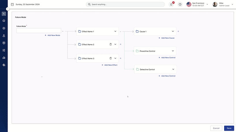
Canvas Approach
Firstly i had to finalize the base based on the problem statement. Since the main motto is to help users to quickly get the relationship between all the elements with the help of connectors.
The "F" pattern
As the regular pattern to scan the information is F pattern so aligned the visual elements accordingly based on the user flow. To start with, user will first provide the name for Failure mode and then start configuring Effects followed by Causes etc. The same information is aligned in "F" pattern.
Isolation Effect
Risk manager is a data heavy application but user may not be interested or in need to view the data everytime as it creates cognitive load. Followed Isolation Effect to display only that information that user is interested at and hide the rest. By this the users focus will be on the intent with less cognitive load also makes the UI clean.
Scalability
User can able to add up to any levels of Failure modes as it differs based on the company's needs. So we cannot limit with a number. Pattern should be scalable to add any Effects or Causes.
The new "Risk Creation"
.png)
Prototype
Usability Testing
We have performed usability tests with 6 external users from Roche and GSK and below are the findings.
Research Questions - Adding and Viewing a Cause
-
Are the users successfully able to create and delete many causes within the screen?
-
Are the users aware of creating multiple causes which can be done by clicking on the Add New button?
-
Is the expand/collapse interaction that occurs when the Add New button is clicked, distracting?
Research Questions - Adding another Effect and Viewing previously created effects
-
Are the users able to navigate and find inputs related to effect creation within the layout and create an effect?
-
Are the users aware of creating multiple effects which can be done by clicking on the Add New button?
-
Are the users successfully navigating between various created effects?
Navigation and Interaction
-
6 out of 6 participants easily identified and used the “+ Add New” button to create new elements.
-
2 participants were unclear about the function of the “+” and “-” buttons for expanding/collapsing elements.
-
1 participants suggested that the “+ Add New” button should be positioned closer to the card instead of at the bottom.
-
3 participants found the chevrons for expanding/collapsing intuitive after initial interaction.
-
2 participants initially misunderstood how expanding/collapsing works but later found it helpful in understanding the hierarchy.
Deletion and Error Handling
-
4 out of 6 participants suggested adding a confirmation dialog before deleting to prevent accidental removals, especially when bulk-deleting.
-
3 participants were initially confused about what happens when elements are deleted but understood the process after performing the task.
Feature and Layout Suggestions
-
3 participants suggested giving users control over which fields are displayed in each card since different organizations follow different risk assessment structures.
-
2 participants suggested that Occurrence and Detectability should have their own cards after Controls instead of being placed under Cause.
-
1 participant suggested color-coding or visual enhancements to differentiate linked elements.
-
1 participant wanted a clearer end goal or endpoint in the risk creation process.
-
1 participant suggested an option to manually link/unlink Causes and Effects since relationships between elements can vary.
Next steps
We have made an initial attempt with a complete different design pattern that doesn't exist in the current application. We wanted to check users to analyse how open and receptive with the latest design patterns so that we can start thinking in that direction. This was first draft made but needs further refinements on button labellings and other assistive features when there are more Failure modes, Effects and Causes.
Problem Statement 2
Interaction Design : How users can configure values for each factor?
We arrived at Ranking and are stuck at one point where the user has to configure values for each factor. To do so, they have to go through 7 levels in Navigation.
Below snippet will help you for better understanding on the levels of hierarchy to configure values for each factor.

How i adopted User centered process ?

1. Research and Understanding users
We have conducted user interviews through MS teams with the end users who were using our Risk standalone app. Participants of the interview are primarily from GSK, Roche and Bayer to gather feedback.
Many of the users have pointed out that the learnability is more for a new user as the page templates, navigations, styles and functions look very complicated and they were not designed for user convenience.
“Cognitive load and learnability is high for new users.”
“Pages are bombarded with data”.
It’s a huge module but we tried to do a SWOT analysis on the current app so that we can address them on the use cases that we are currently working on.
2. Conduct Ideation sessions to allign with requirements
Since we are only bringing some of the requirements from standalone apps, we also have to make sure how best we can blend those requirements with the latest platform and systems.
Coordination with the product owner helped me to dig deeper into every bit of information, as we are doing it for the first time and I am familiar with my current platform NGP so even if the product owner had different expectations I used to explain the current platform and made them understand how it’s made and how best we can blend these requirements to make use of platform level general components. Accordingly we used to come in mutual terms to freeze the requirements.
Iterate, Iterate and Iterate


3. Keep it simple and consistent
As we have finalized the layout for the page so that it is going to be consistent across all the parameters, it was somewhat challenging to accommodate all the parameters and its details in the finalized template.
We have worked on multiple iterations to arrive at a point where we got the feedback that this looks simple, clear and consistent.
4. Provide intuitive navigation
As the screen is loaded with multiple things having different UI elements, the main motive was to keep the screen as clean as possible so that the cognitive load will be less on user and show only what is needed for a user instead of showing everything. The idea was to provide basic UI elements for navigation of which the user is familiar with.
Considering all the scenarios and after going through multiple iterations we have arrived at two different approaches
a. One with the flyout (which is a generic and a common pattern that we have in the platform )
b. Have tried a new pattern in the design to maintain the relevance and allow users to do inline configuration of values by providing appropriate visual cues.
a. Flyout approach

b. Inline Configuration of values

5. Test with users
Now that we have two options for our use case, I wanted to evaluate by conducting the A/B testing out of the two options by defining the clear objectives and creating a prototype accordingly.
To achieve this we have invited participants from GSK, Bayer along with some internal users mostly Product owners, Product Heads and Engineering Managers. So we tested with 15 users combining all. 6 External users and 9 Internal users. Below are the results
Objective : With the help of current prototype, can you please help us knowing how you can add factors and define values for each factor ?
a. Flyout approach by tagging values to factor creation


b. Inline configuration of values


6. Offer Assistance and Feedback
As we are bringing this module to our platform for the first time, the terminologies, usage, tools are very new and technical. So before even starting off the project I decided to make this module content rich by providing Descriptions, Placeholders, Tool tips wherever required. Worked closely with Content Designer and Product Managers
As the patterns were accepted and approved by the management and other stakeholders, I was happy knowing that we are going to adopt the same for the upcoming module on our platform. We have set a benchmark to make use of our templates for upcoming modules.
Also we paid special attention to the feedback messages, Form validations and Toast messages plays a part. But defined rules for each use case, when to bring validation and when to bring toast. If it’s toast whether it's auto close or manual close.


Prototype

Problem Statement 3
New feature proposal - Auto detection of Blurriness and Low Quality Files
As our systems are serving the Pharma and Life Sciences industry where the documents, evidence and workflows play a vital role in the entire ecosystem. But the real problem that we noticed is most of the evidence that the users upload are either blurred and not cleared. And these documents with real time values will act as a strong proof in subsequent manufacturing process. Unless these documents are validated by approvers the entire process gets delayed. So the provided documents should be clean, clear and readable by any users.
So I started with research to find the best AI tools that can provide models to unblur, sharpen and adjust the images and documents. And made a decent list of tools that can fulfill our needs. Started analysing and comparing the tools.
Need is very simple,
-
Tool that can unblur and sharpen the image
-
Tool which can also upscale the document
Findings
We narrowed down with Deepimage AI.
Why Deepimage AI ?
Yes, DeepImage, being an AI-powered image enhancement tool, will analyze the image before applying enhancements, using deep learning algorithms to identify key features like brightness, contrast, noise levels, and object details to determine the best way to improve the image quality based on its specific characteristics.
Key points about DeepImage's analysis process:
-
Automatic detection: DeepImage can automatically detect issues like blurriness, low resolution, poor lighting, and color imbalances in an image.
-
Convolutional Neural Networks (CNNs): These powerful neural networks are often used by DeepImage to analyze the image at a pixel level, allowing for detailed understanding of the image content.
-
Adaptive enhancement: Based on the analysis, DeepImage can apply different enhancement techniques like noise reduction, sharpening, color correction, and super-resolution to the specific areas of the image that need improvement
Proposal
When a user uploads any file, Deepseek will start analyzing the image quality accordingly platform will prompt a user on the image quality so the user can make use of this feature to upscale it by clicking on the icon here. Image will start upscalling. Once completed platform will intimate user on successful enhancement.

User can also chose to view the document first and then upscale.

User can perform upscalling instantly as soon as they were informed without viewing the image to save time

Next Steps
Managing risk in Life Sciences requires precision, compliance, and efficiency. Our Risk Manager module was built with a User-Centered Design (UCD) approach, but there is a great opportunity in ensuring an intuitive experience while leveraging AI-driven automation to streamline risk assessment and mitigation.